And I though hipsters were picky about IPAs…
Working with the International Phonetic Alphabet (IPA) is the bread and butter of many linguists. Although an intimidating wall of strange symbols at first, it doesn’t take long to develop a solid working knowledge and start using it for kinds of cool things.
What’s more, getting IPA symbols into your documents hasn’t been much of an issue since the introduction of Unicode in the early 90s1.
However, just because you and your computer can handle these symbols doesn’t mean the font you use will render them accurately, in the eyes of the International Phonetic Association at least. Misbehaving serifs and unruly descenders might mean the way your paper displays the IPA deviates just slightly too far from the Association’s approved character set.
Fonts of wisdom
For a taste of what the Association has to say about fonts, here’s some of their “general advice”:
With any font you consider using, it is worth checking that the symbol for the centralized close front vowel (ɪ, U+026A) appears correctly with serifs top and bottom; that the symbol for the dental click (ǀ, U+01C0) is distinct from the lower-case L (l); that the symbol for the labiodental flap (ⱱ, U+2C71) is included in the character set; and that the software correctly renders the horizontal alignment of diacritics placed above or below a letter and of the tie bars U+035C and U+0361.
Technical indeed.
Fortunately for us schmucks, the Association nevertheless approves of several commonly used fonts for general use: Times New Roman, Arial, Courier New, Segoe UI, Doulos SIL and DejaVu Sans. Moreover, any Unicode-compliant serif font is appropriate for submitting manuscripts to the Journal of the IPA.
Top of the charts
We’re not off the hook yet though. Pedantry is taken to a whole new level when the IPA chart comes into the equation. Effectively, this chart is the gold standard for what each symbol in the International Phonetic Alphabet should look like.
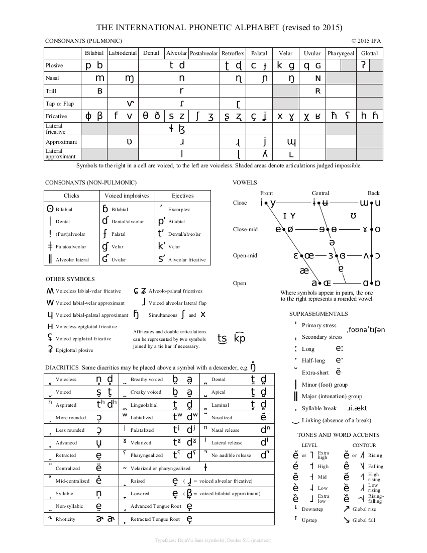 The 2015 IPA chart. A full list of symbols used to describe the sounds of the world’s languages.
Pictured above is the 2015 chart. The font used is, predominantly, IPA Kiel - an obscure serif font named after the historic phonetics convention in Kiel, Germany, in 1989. But even this isn’t quite right. Several characters in the chart actually come from different fonts to satisfy the Association’s refined tastes.
And despite acknowledging its impracticality, the Association “recommends this version of the chart as an ideal."2
However, in its benevolence, the Association also provides two alternative IPA charts in widely available, Unicode-compliant fonts: DejaVu Sans and Doulos SIL.
Underneath these charts, though, are lists of passive aggressive comments detailing where the fonts fall short. Sorta like the notes your flatmate would leave on the fridge, if your flatmate were an opinionated, highly-regarded phonetician. To get an idea, here’s the first comment about the DejaVu chart:
The symbol for the labiodental flap is not quite right in this font (and in many fonts). We recommend using the symbol from another sans serif font, SIL’s Andika, for this symbol.
Sick burn. Let’s look at the difference.
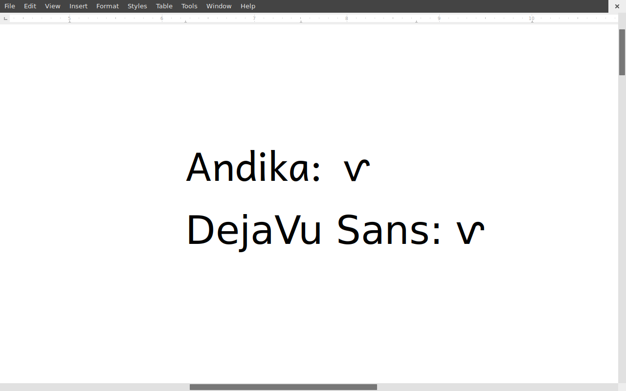 A comparison of the symbol for the labiodental flap in Andika and DejaVu Sans.
You should be ashamed of yourself DejaVu Sans. Simply ashamed. That egregious representation of our beloved U+2C71 deserves all the faint derision it gets.
Not all doom and gloom
One would think by now the Association could have fixed its problem and just produced a font of its own. Oh wait, it has. The font is called TeX TIPA Roman, or Unitipa. And what a marvel it is! Finally, a something which respects the sanctity of the IPA. The only problem is that the IPA chart in which it features is so new it hasn’t been published on the Association’s website yet. Currently the best place to find a copy is here.
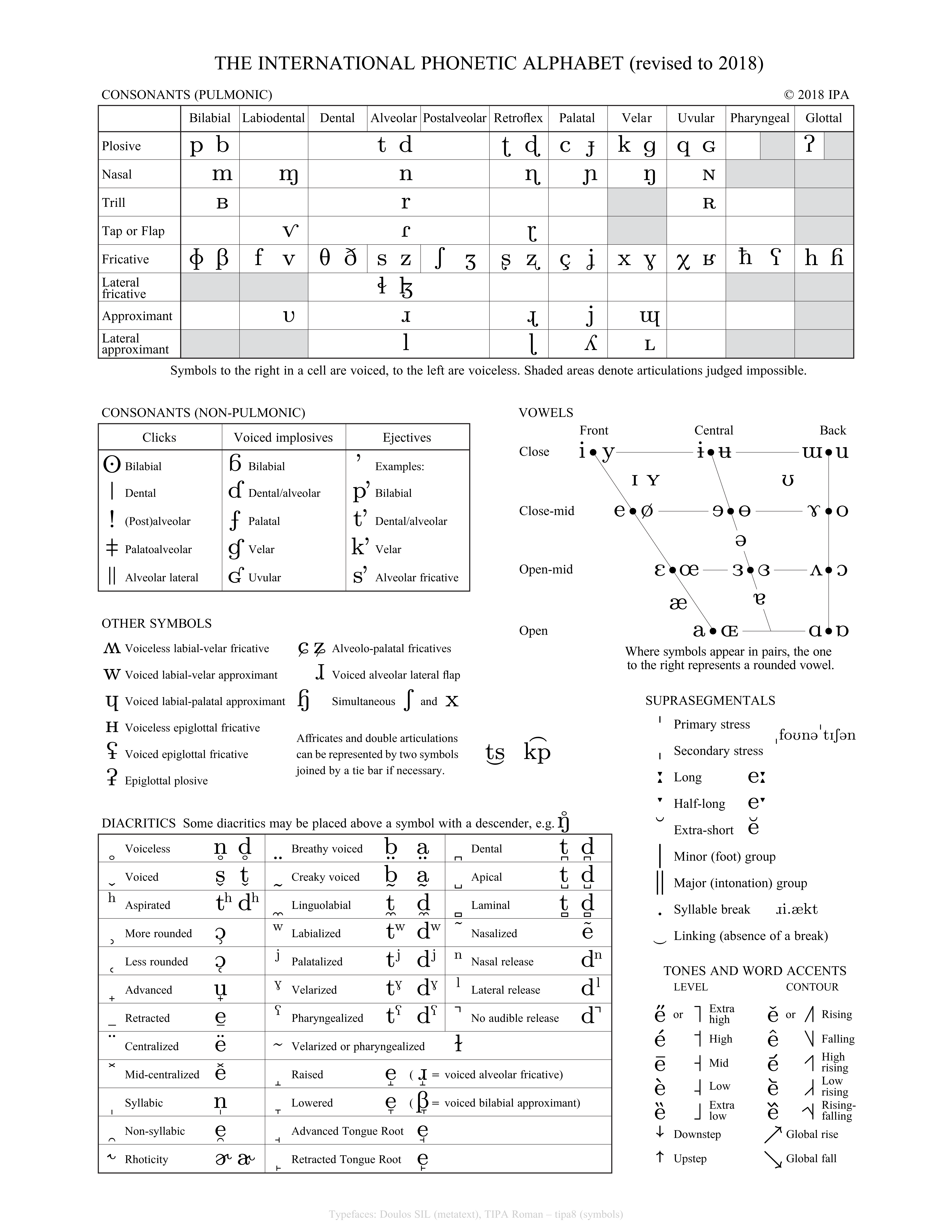 The 2018 IPA chart in all it’s officially sanctioned glory
At last, something that get things right! Unitipa has a classy, early 20th century vibe. It requires no symbols from other fonts. It’s Unicode-compliant. The uvular trill has a hearty swash. In short, it’s perfect. Hopefully it begins its steady percolation soon.
Concluding remarks
I am genuinely gladdened the case has been closed on this one. The world is better place now that our phoneticians can spend more of their time researching human speech, rather than squinting at screens and tutting at serifs. And I’ll happily raise an IPA to that.